HeavyBid Overview video
This video lives on the main product page, and contains an overview of HeavyBid software. It is currently live on HCSS website: https://www.hcss.com/products/construction-estimating-software/
The problem
HeavyBid, a flagship HCSS estimating software did not have a hero video on its main page. With a full website redesign underway, it was important that each major product has a hero video that would briefly explain the software and its value for a business.
My role in this project
My job was to create the storyboard, design the visual elements, and animate them.
Solution
My main goal was to create a video that would keep the viewer’s attention, and show the key benefits of HeavyBid. I also wanted to refresh and maintain the company branding through animation.
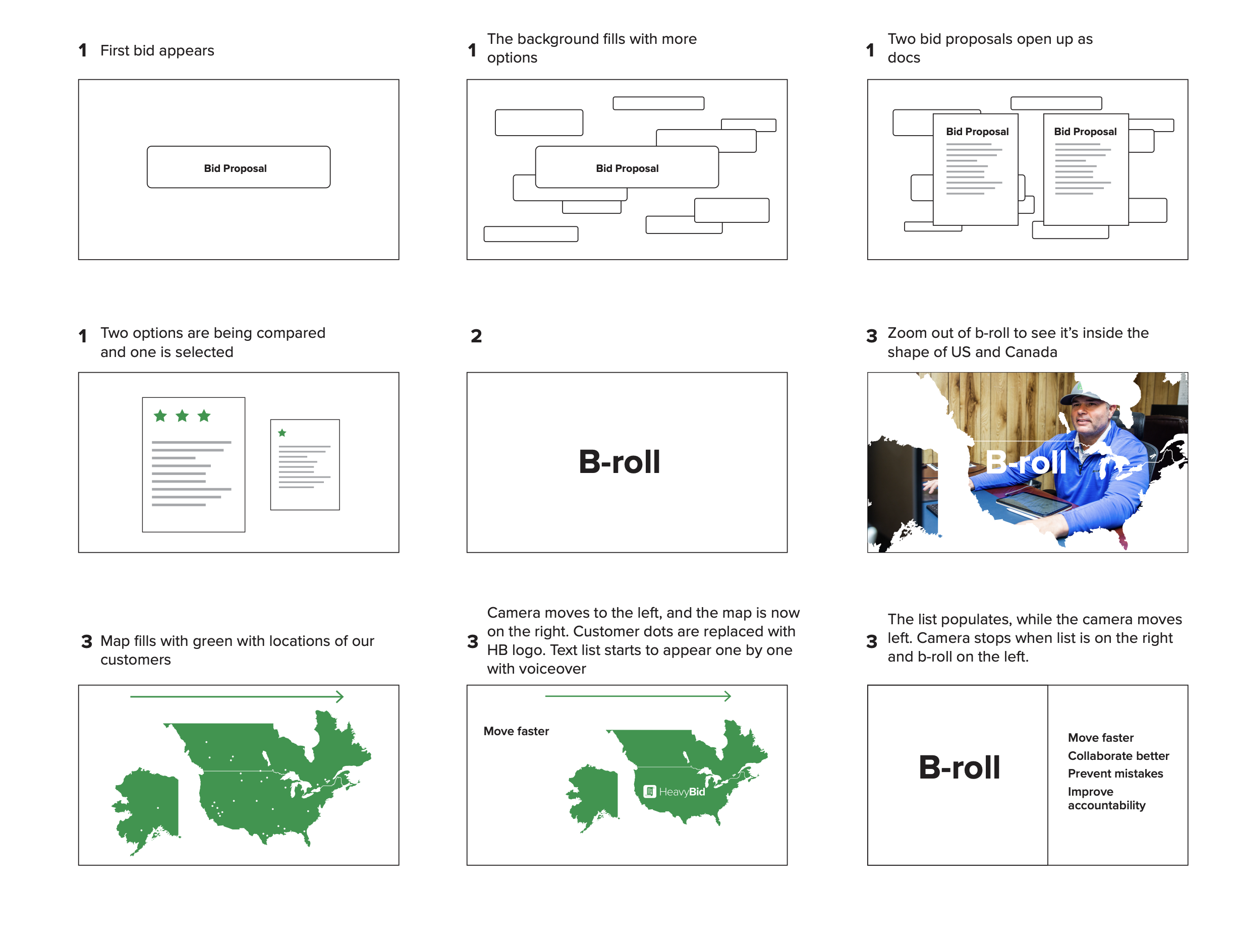
Having previously worked on the HeavyJob overview video, I learned that a detailed storyboard would be much more beneficial that the quick and loose one. Since it is my job to design both, I created a more detailed storyboard that I later split into video assets ready for animation. I defined colors, shape, and composition early on, and it was a great help in the design stage. Page 1 of the storyboard can be seen below.
![]()
The first draft of the video was made in 2d space, with elements moving through the artboard. It looked okay on the first go, but lacked more engaging transitions and movement. After some testing, I decided to move all the elements into a 3d space, and have the “camera” to the right, as well as into and away from the background. This added a lot of depth to the video, and made it feel more dynamic, despite having technical voiceover.
This is what the video looked like after the changes.
![]()
![]()
![]()
![]()
![]()
Challenges
The biggest challenge in this project was the technical difficulties that came up when having two people work on the same file. My responsibility was to complete most of the animation, while our videographer worked on editing and adding b-roll and voiceover. After trying Adobe cloud, Google Drive, we settled on taking turns working on the file on the server. This meant we couldn’t work on it at the same time, because it would create multiple copies of the project. While not an ideal solution, we were able to complete the project through good communication and constant collaboration.
Outcome:
Since the video has been uploaded only for a couple of weeks, it is too early to say how it would affect conversions and page stay. Working on this projec really helped me hone in on my design and motion graphics skills. More importantly, with 4 more software overview videos on the way, it provided a good frame of reference for the future videos.
The problem
HeavyBid, a flagship HCSS estimating software did not have a hero video on its main page. With a full website redesign underway, it was important that each major product has a hero video that would briefly explain the software and its value for a business.
My role in this project
My job was to create the storyboard, design the visual elements, and animate them.
Solution
My main goal was to create a video that would keep the viewer’s attention, and show the key benefits of HeavyBid. I also wanted to refresh and maintain the company branding through animation.
Having previously worked on the HeavyJob overview video, I learned that a detailed storyboard would be much more beneficial that the quick and loose one. Since it is my job to design both, I created a more detailed storyboard that I later split into video assets ready for animation. I defined colors, shape, and composition early on, and it was a great help in the design stage. Page 1 of the storyboard can be seen below.
The first draft of the video was made in 2d space, with elements moving through the artboard. It looked okay on the first go, but lacked more engaging transitions and movement. After some testing, I decided to move all the elements into a 3d space, and have the “camera” to the right, as well as into and away from the background. This added a lot of depth to the video, and made it feel more dynamic, despite having technical voiceover.
This is what the video looked like after the changes.


Challenges
The biggest challenge in this project was the technical difficulties that came up when having two people work on the same file. My responsibility was to complete most of the animation, while our videographer worked on editing and adding b-roll and voiceover. After trying Adobe cloud, Google Drive, we settled on taking turns working on the file on the server. This meant we couldn’t work on it at the same time, because it would create multiple copies of the project. While not an ideal solution, we were able to complete the project through good communication and constant collaboration.
Outcome:
Since the video has been uploaded only for a couple of weeks, it is too early to say how it would affect conversions and page stay. Working on this projec really helped me hone in on my design and motion graphics skills. More importantly, with 4 more software overview videos on the way, it provided a good frame of reference for the future videos.
Houston Chamber Choir 2022-23 Season
About 2022-23 Season Artwork
Here is a set of seven designs I have created for the Houston Chamber Choir in 2022. At the end of every season, usually late spring, many performing arts organizations start their planning for the upcoming seasons, which involves concepts for shows/concerts, as well as marketing planning. HCC had written a brief on every concert, and after some research, I came up with a few visual concepts for what it could look like. The client was really drawn to an expressive illustration style done with digital pencil.
The theme of this season was ”Earth”, and each artwork represents nature. Some of the works, like “Ancestors’ Dream” and “Hear the Future” are more abstract, while “This Land is Your Land” is a drawing of a real location.
The design for each artwork is modular, so that the choir’s marketing team could take the elements and arrange them in any formation for later purposes, like email banners, posters, or digital marquees.
![]()
![]()
![]()
![]()
![]()
![]()
Here is a set of seven designs I have created for the Houston Chamber Choir in 2022. At the end of every season, usually late spring, many performing arts organizations start their planning for the upcoming seasons, which involves concepts for shows/concerts, as well as marketing planning. HCC had written a brief on every concert, and after some research, I came up with a few visual concepts for what it could look like. The client was really drawn to an expressive illustration style done with digital pencil.
The theme of this season was ”Earth”, and each artwork represents nature. Some of the works, like “Ancestors’ Dream” and “Hear the Future” are more abstract, while “This Land is Your Land” is a drawing of a real location.
The design for each artwork is modular, so that the choir’s marketing team could take the elements and arrange them in any formation for later purposes, like email banners, posters, or digital marquees.


HCSS Events Page
This project is a redesign of an Events page for Heavy Construction Systems Specialists.
The problem
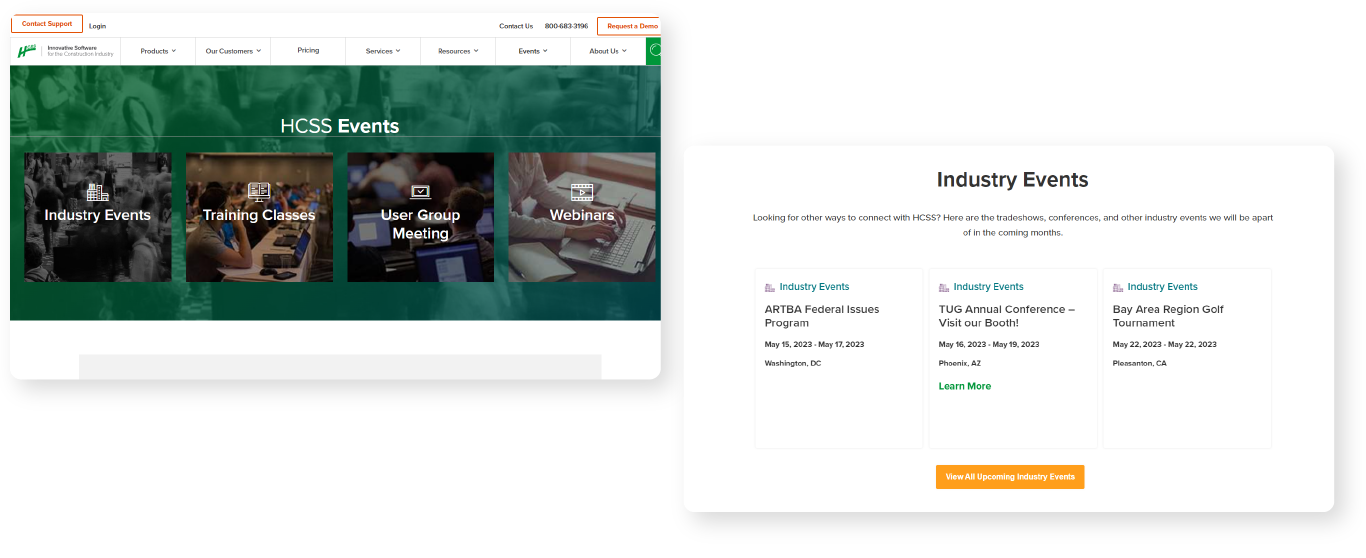
The current HCSS events page was outdated and and not user-friendly. The heat map of the page showed that people spent most of the time on the very top of the page, and didn’t scroll down to learn more about the types of events shown.
Here you can see the previous page design:
![]()
My role in this project
I was in charge of designing the main page, as well as creating a high-fidelity page prototype.
How I came up with the solution:
The client wanted to make the page look like an event page of another construction-related company. It had a different structure than HCSS’ events page, mainly because it used lots of imagery, and a different event filter system. I wanted to create a solution that utilized HCSS branding and incorporated a new page structure. I also wanted to fix the top navigation that was busy and hard to read.
How my solution solved the problem
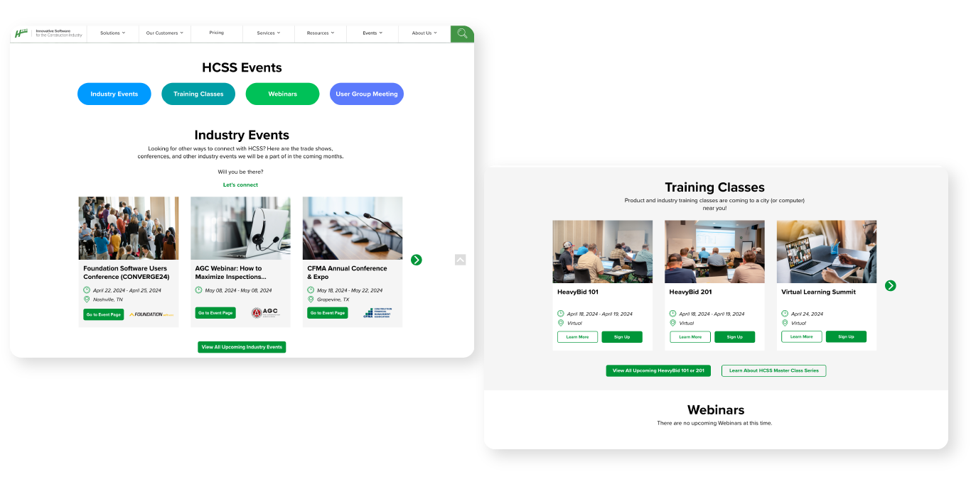
The final design thar got approved eliminated the confusion of navigating the page. The images help convey the type of event the users would be attending, and removing overlapping photos from the nav section made it very clear what types of events HCSS was offering. Furthermore, adding company logos to each event card helped clarify that some events were attended by HCSS, and not hosted. This was a very important detail for the client, and we wanted to be clear about the company's role in the event.
High-fidelity web and mobile prototypes of the final product:![]()
![]()
Challenges I faced
One of the bigger challenges in this task was miscommunication between me and the client. After presenting the first prototype, I learned that they still wanted to maintain the same structure for the website, and just needed an updated navigation bar and a page layout that had images. In the end, I ended up scrapping the first design, and getting back to a more minimal page redesign. Now, there were no filters and no tags on each event listed chronologically. Instead, the page was broken into sections of each event type: conference, webinar, classes, and golf tournaments. A full list of events could be viewed either by clicking a button or by horizontal scroll.
Here is the first draft that got rejected:![]() Results
Results
After a few months of tracking the activity on the Events page, we learned that the engagement has increased by 13%. On top of that, the heat map for the page was now mostly red and orange, showing that the users were encouraged to scroll down to read about the events.
Live page can be viewed here.
The problem
The current HCSS events page was outdated and and not user-friendly. The heat map of the page showed that people spent most of the time on the very top of the page, and didn’t scroll down to learn more about the types of events shown.
Here you can see the previous page design:
My role in this project
I was in charge of designing the main page, as well as creating a high-fidelity page prototype.
How I came up with the solution:
The client wanted to make the page look like an event page of another construction-related company. It had a different structure than HCSS’ events page, mainly because it used lots of imagery, and a different event filter system. I wanted to create a solution that utilized HCSS branding and incorporated a new page structure. I also wanted to fix the top navigation that was busy and hard to read.
How my solution solved the problem
The final design thar got approved eliminated the confusion of navigating the page. The images help convey the type of event the users would be attending, and removing overlapping photos from the nav section made it very clear what types of events HCSS was offering. Furthermore, adding company logos to each event card helped clarify that some events were attended by HCSS, and not hosted. This was a very important detail for the client, and we wanted to be clear about the company's role in the event.
High-fidelity web and mobile prototypes of the final product:

Challenges I faced
One of the bigger challenges in this task was miscommunication between me and the client. After presenting the first prototype, I learned that they still wanted to maintain the same structure for the website, and just needed an updated navigation bar and a page layout that had images. In the end, I ended up scrapping the first design, and getting back to a more minimal page redesign. Now, there were no filters and no tags on each event listed chronologically. Instead, the page was broken into sections of each event type: conference, webinar, classes, and golf tournaments. A full list of events could be viewed either by clicking a button or by horizontal scroll.
Here is the first draft that got rejected:
 Results
After a few months of tracking the activity on the Events page, we learned that the engagement has increased by 13%. On top of that, the heat map for the page was now mostly red and orange, showing that the users were encouraged to scroll down to read about the events.
Live page can be viewed here.


Case Study Pages
This is a design for a desktop and mobile version of HCSS Case Study web pages. The company wanted to highlight recently conducted customer case studies, as well as refresh the pages. I wanted to create something similar to news pages layout, with one story highlighted, and a gallery to view the rest.
The main story follows a similar news-style layout, with a layout that highlights the main story and helps highlight the software used in a case study.
Live Case Studies page can be viewed here.
![]()
The main story follows a similar news-style layout, with a layout that highlights the main story and helps highlight the software used in a case study.
Live Case Studies page can be viewed here.

Video: HeavyJob overview
HeavyJob is a software by Heavy Construction Systems Specialists that helps project managers and construction workers track their constructions costs, materials, and work hours in the field and office. The overview video lives on the top of the product main page, and provides a brief intro explaining the benefits of the software.
The Problem: The previous product video was created many years ago, and has since become outdated. It heavily featured B-roll interchanged with screen recording of a user navigating the software. In the old version of the video, the full functionality of the product did not translate due to small screen details. This also affected the pacing of the video, with the screen recordings being slow and not exciting.
![]()
My Role: On a two-person team, I was responsible for designing all of the graphic elements. I sketched the storyboard, designed illustrations, icons, backgrounds, and text, and animated most of these elements.
Proposed solutions: To come up with the look of the video, I have conducted research into other software companies, and analyzed the flow of the videos and the stylistic choices of graphics. I developed a brief storyboard that included about 10 boards, detailing the angles and implied motions. After finalizing the storyboard, I sourced the images needed. Many of them, like people and icons, could be found in Adobe stock, and all that was needed was to pick the elements I liked, rearrange them into a new composition, and then recolor them to match the look of the video. The others, like the software interfaces, had to be created from scratch. I designed five User Interfaces that represented a simplified view of each screen, where I could enlarge the text, replace small text with lines, and make sure I show enough of the graph to drive the point across without overwhelming the composition. After I had all my design elements ready to be imported into After Effects, I moved onto animation. This part was pretty straightforward, and the most important thing was to keep the pace of the video consistent with the voiceover.![]()
Some of the simplified product interface graphics I designed in Adobe Illustrator. All of the boxes, shapes, and text were placed into different layers to be animated separately.![]()
How these solutions solved the problem: Updating the graphics and b-roll of the video helped refresh of the look of the website. It also provided a more user-friendly overview of the product.
Challenges: Every step of the project had its own set of challenges. The initial script had suggestions for visuals, and I had to look realistically at which of them would look good in the video, and which would stand out too much. For example, one of the wishes on the script was to have a bulldozer drive past the camera, and the puff of smoke after it would reveal one of the value propositions. While it sounds good on paper, an effect like this could easily look dated. Another challenging part of the video was showing how the software works in the field and in office. The first idea I had was showing the ipad fly horizontally from one location into another. This felt too literal, and too long. Instead, I used a match cut to use the downward motion of the central element (iPad) to quickly switch the background from field to office.
What I learned: This project gave me a good understanding of the importance of a detailed storyboard. What I had was a series of loose sketches, and it would’ve been helpful to have them properly designed and even colored, because this would have allowed me to focus more on animation and less on the design.
The full Video
The Problem: The previous product video was created many years ago, and has since become outdated. It heavily featured B-roll interchanged with screen recording of a user navigating the software. In the old version of the video, the full functionality of the product did not translate due to small screen details. This also affected the pacing of the video, with the screen recordings being slow and not exciting.

My Role: On a two-person team, I was responsible for designing all of the graphic elements. I sketched the storyboard, designed illustrations, icons, backgrounds, and text, and animated most of these elements.
Proposed solutions: To come up with the look of the video, I have conducted research into other software companies, and analyzed the flow of the videos and the stylistic choices of graphics. I developed a brief storyboard that included about 10 boards, detailing the angles and implied motions. After finalizing the storyboard, I sourced the images needed. Many of them, like people and icons, could be found in Adobe stock, and all that was needed was to pick the elements I liked, rearrange them into a new composition, and then recolor them to match the look of the video. The others, like the software interfaces, had to be created from scratch. I designed five User Interfaces that represented a simplified view of each screen, where I could enlarge the text, replace small text with lines, and make sure I show enough of the graph to drive the point across without overwhelming the composition. After I had all my design elements ready to be imported into After Effects, I moved onto animation. This part was pretty straightforward, and the most important thing was to keep the pace of the video consistent with the voiceover.

Some of the simplified product interface graphics I designed in Adobe Illustrator. All of the boxes, shapes, and text were placed into different layers to be animated separately.

How these solutions solved the problem: Updating the graphics and b-roll of the video helped refresh of the look of the website. It also provided a more user-friendly overview of the product.
Challenges: Every step of the project had its own set of challenges. The initial script had suggestions for visuals, and I had to look realistically at which of them would look good in the video, and which would stand out too much. For example, one of the wishes on the script was to have a bulldozer drive past the camera, and the puff of smoke after it would reveal one of the value propositions. While it sounds good on paper, an effect like this could easily look dated. Another challenging part of the video was showing how the software works in the field and in office. The first idea I had was showing the ipad fly horizontally from one location into another. This felt too literal, and too long. Instead, I used a match cut to use the downward motion of the central element (iPad) to quickly switch the background from field to office.
What I learned: This project gave me a good understanding of the importance of a detailed storyboard. What I had was a series of loose sketches, and it would’ve been helpful to have them properly designed and even colored, because this would have allowed me to focus more on animation and less on the design.
The full Video